Solving Challenges to Build Better Community Experiences
Global community app for residents across India, Italy & Brazil

About
The Planet App is a community platform by Planet Smart City that makes communication and collaboration easy for residents in gated communities and apartment complexes. It helps manage everyday activities while making it simple to organize events and build stronger neighborhood connections.
Organisation
Planet Smart City
Year
Jul ‘22 - Feb ‘24
Role
User Experience Designer
Website
www.planetsmartcity.com
Solutions offerings
Planet Smart City is an innovative prop-tech company dedicated to creating sustainable and inclusive communities by seamlessly integrating technology into design, construction, and everyday living.


Planet SIM (Smart Infrastructure Management) Integration in Planet App
Background
The Planet App initially designed in Italy, underwent extensive testing in local communities. After a successful trial period in Brazil involving residents and managers, it was subsequently launched in India, with an emphasis on future product expansion.


My Role
As a UX Designer at Planet Smart City, I created MVP and user flows to refine the existing Planet App for the Indian market while integrating key functionalities and designing new features for residents in Italy and Brazil. Following an agile design process, I collaborated closely with developers to ensure the seamless integration of Back Office ERP features.

93+
Figma files designed for planet app, developed and deployed to planet app users.
150+
User stories and use cases solved with an Intuitive user experience.
67%
Proven user engagement.
45K+
Happy users from three different countries.

Existing Competitors
Through competitive analysis of leading gated community apps such as MyGate, NoBrokerHood, ADDA, and Apna Complex, combined with user feedback and direct resident engagement, we designed a comprehensive app that addresses common pain points, enhances the user experience, and strengthens community connections.

Surveys & Interviews
Ethnographic surveys and user interviews were conducted with residents of Three Jewels Society in collaboration with community managers and a business analyst. Based on the research insights, user needs, and age groups, we created user personas to guide the design process.

Three Jewels Society, Pune
18%
16 - 22 years old
25%
22 - 35 years old
37%
35 - 47 years old
12%
47 - 55 years old
8%
55 - 61 years old
Key Pain Points
Residents often feel isolated due to limited social connections. Working parents struggle to balance work and family life while lacking access to child-friendly activities. Seniors and retirees face limited access to essential community services, resulting in inconvenience and reduced interaction with younger residents.

Ethnographic survey with Three Jewels Society residents & security guard
The Challenges
The primary challenge was to design a user-friendly app that aligned with Planet Smart City’s vision while meeting stakeholder expectations and company guidelines within tight deadlines, all while working with limited design assets provided by the Italy team.
Designing the MVP and user flows for the Planet App in the Indian market required cultural awareness, design thinking, and close collaboration. Addressing these challenges was essential to meet market needs and deliver an experience that exceeded user expectations.

Planet App Version 1.0 (Old)
Brand guidelines
The brand guidelines, created by the Italian marketing team, emphasized community, balance, and solidarity through the logo’s four core pillars: diversity, sustainability, innovation, and community engagement. Despite these design constraints, I crafted the Planet App to align with the brand’s vision while fostering trust and meaningful connections among residents.

Ideation
We used card sorting and design thinking workshops with cross-functional teams to identify opportunities for improving the app and gather insights directly from residents. Using affinity mapping, we prioritized potential features based on user needs and preferences, resulting in a clear roadmap of ideas for the MVP.

Information Architecture
Two of the four information architecture iterations were selected for further refinement. These iterations ultimately shaped the app’s final feature and content structure.

User Flow
Key user flows included creating groups, booking community amenities, and reserving items from the Library of Things. These features streamlined residents’ daily activities by providing an intuitive booking experience with scheduled reservation and return dates.

Wireframes
Sketching paper wireframes and iterating on digital wireframes helped refine the design through continuous feedback from team members and stakeholders. Their experience as residents of gated communities and users of similar competitor apps provided valuable insights that informed design decisions throughout the process.

High fidelity designs & Prototype
Designed the new version of the Planet App India from the ground up with a modern, user-centric approach and enhanced functionality. Focused on delivering a seamless digital experience through improved performance, intuitive navigation, scalable architecture, and innovative features that address evolving user needs while strengthening the brand’s market presence.
Community
(Home Screen)
1
The Planet App home screen prioritized quick actions over bottom-bar navigation to simplify common tasks. Following the brand guidelines, it used a consistent color palette and organized information cards to enhance clarity, accessibility, and usability.
2
Careful attention was given to the app’s information architecture to ensure users could easily understand the app and navigate seamlessly between different sections.
3
A strong emphasis was placed on improving typography and accessibility, particularly for older users aged 42 to 61+. Based on user feedback, larger font sizes and more prominent, tappable icons were introduced to enhance readability and usability, reducing the need to adjust mobile accessibility settings while using the app.


Activities Calendar
1
The new Calendar screen focused on making it easier for users to manage posts and community activities. Color-coded activity categories improved visual clarity, helping users quickly identify and navigate different events.
2
Events and bookings were presented in a clear, organized layout, making it easy for users to view upcoming activities, manage reservations, and navigate seamlessly between dates and event details.
3
By streamlining the interface with color-coded categories, users could organize their schedules more efficiently, resulting in a clearer, more intuitive, and enjoyable planning experience.

Activity Details
1
The new Activity Details screen focused on creating a user-centered experience that encourages community engagement. It helped users to plan event attendance, connect with fellow participants, and access all essential event information in one place.
2
The screen was redesigned to simplify the user experience by presenting key event information, including the date, time, and description, in a clear and engaging way. The goal was to help users quickly understand each event, encourage participation, and make a stronger connection with their community.

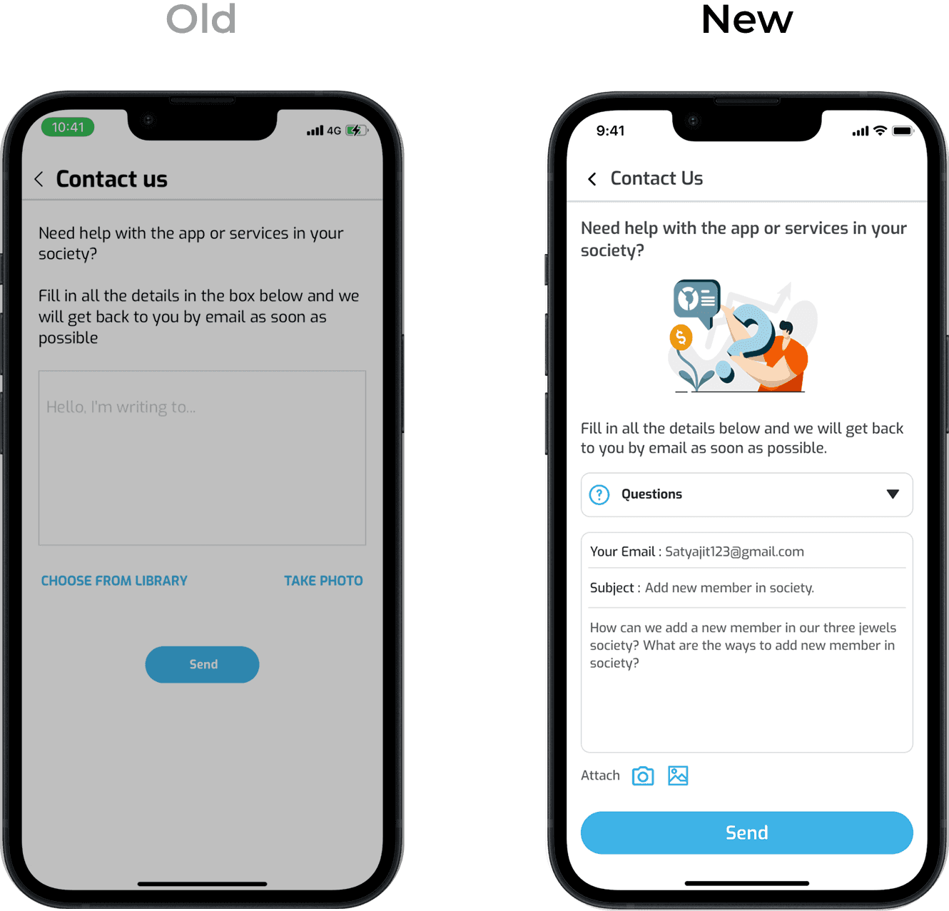
Contact Us
1
The new Contact Us page was created to provide a simple and user-friendly support experience. It enables users to quickly get in touch with the community managers for questions, feedback, or concerns through a clear and accessible interface.
2
The Contact Us page provides multiple support options, including email and an FAQ section, to address different user needs. Users can also attach images when reporting issues, making it easier to communicate problems and receive effective support.
3
Quick response times and reliable support enhance the overall user experience, helping build trust and stronger connection between users and the Planet App community.

Figma Planet App Redesign Prototype Screen.
User Testing
Following user testing, we refined the app’s features based on participant feedback and established an ongoing feedback loop to continuously gather user insights throughout the design and development process. By actively involving users in key design decisions, we created a more user-centered experience that improved usability, encouraged engagement, and better addressed residents’ evolving needs.